Deposify
Deposify: Defining a Disruptive Proposition for the US Security Deposit Market
Project Included: Design Strategy, Packaging Design, Art Direction, Illustration Design

The Brief
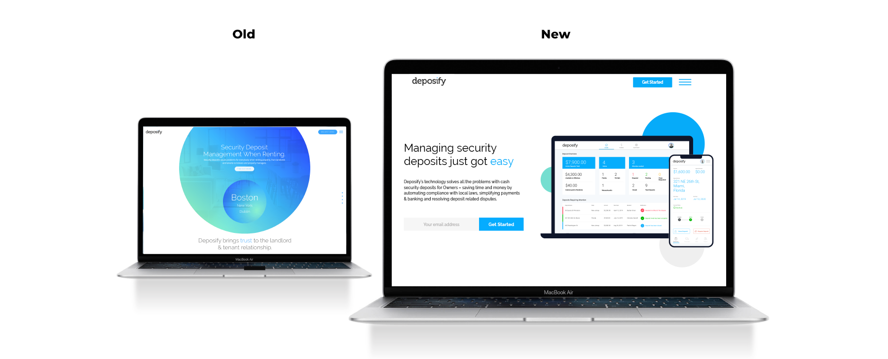
Deposify is an Irish fintech company founded in 2014, who provide an escrow-type service between large scale landlords and their tenants. The Deposify technology helps owners to manage finances and the compliancy obligations involved in handling security deposits across multiple properties and states. In 2019, Deposify wanted to move away from an investment-led communication model to one that would convey the benefits of their product to their customers. Billion was brought on to help them define what their core product offer was and how best to present this to the wider world. At this stage of their startup journey the strategic decision was made to retain the existing logo. However, Deposify did require a new visual identity look and feel in order to effectively communicate their brand message in a unique and memorable way.
The Challenge
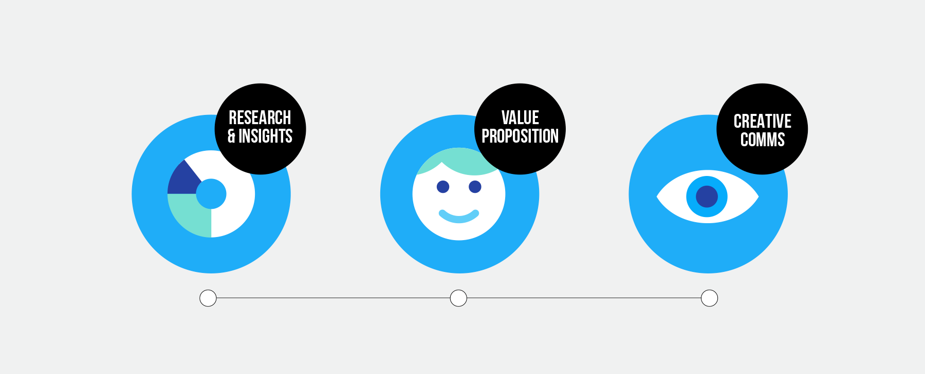
Billion identified two key challenges for this project. Firstly, we needed to simplify the explanation of what is a multi-layered product so that it was more easily understood. Secondly, there are a number of potential customers for the product including property owners, property managers as well as tenants. We needed to identify who the core customer was in order to effectively focus our messaging. To tackle these two challenges directly and efficiently we decided to start with a full day workshop with key stakeholders in the Deposify team. In this workshop we agreed that the initial focus should be on property owners.
The Solution
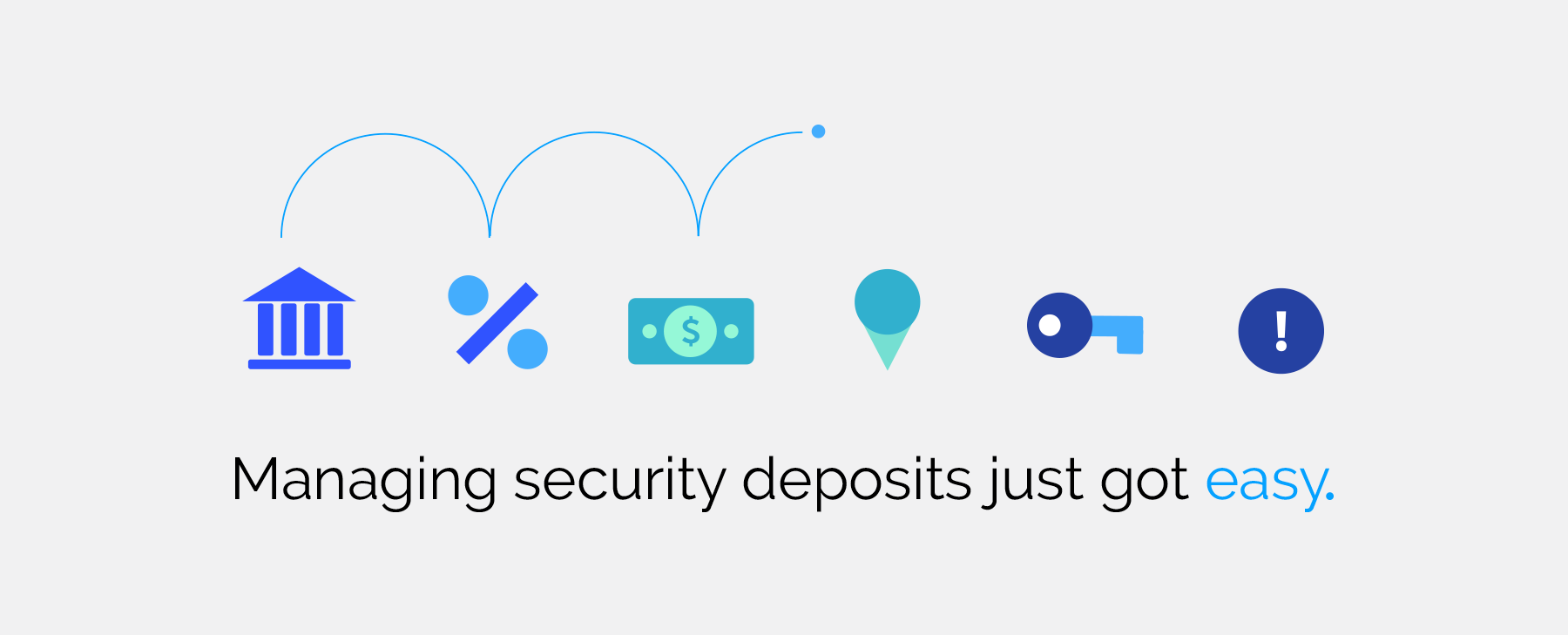
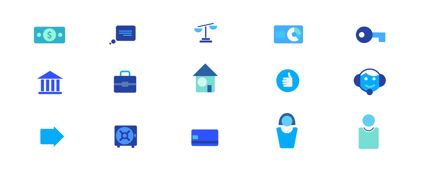
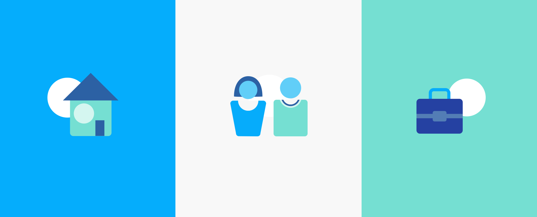
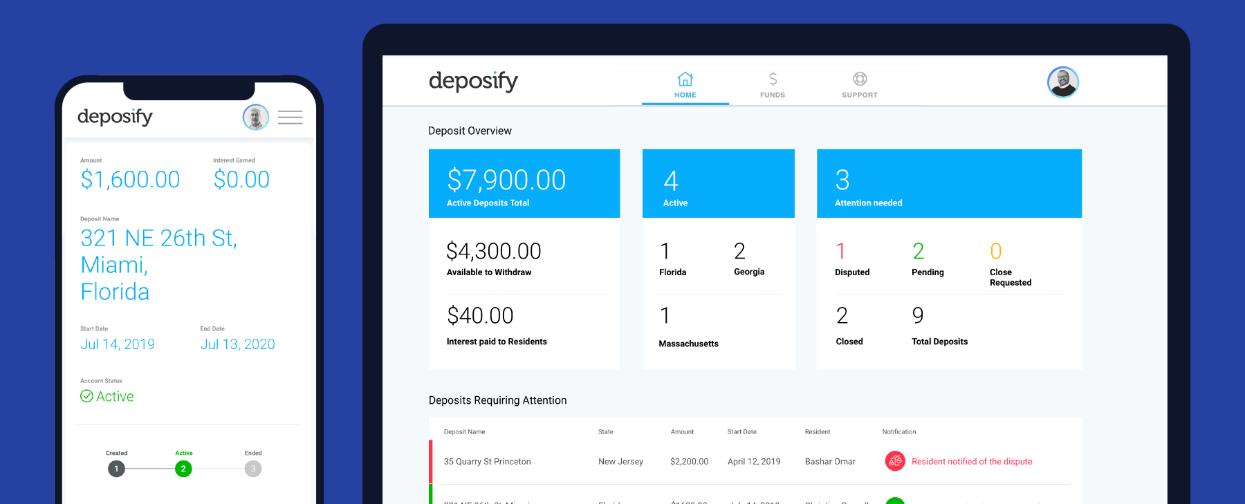
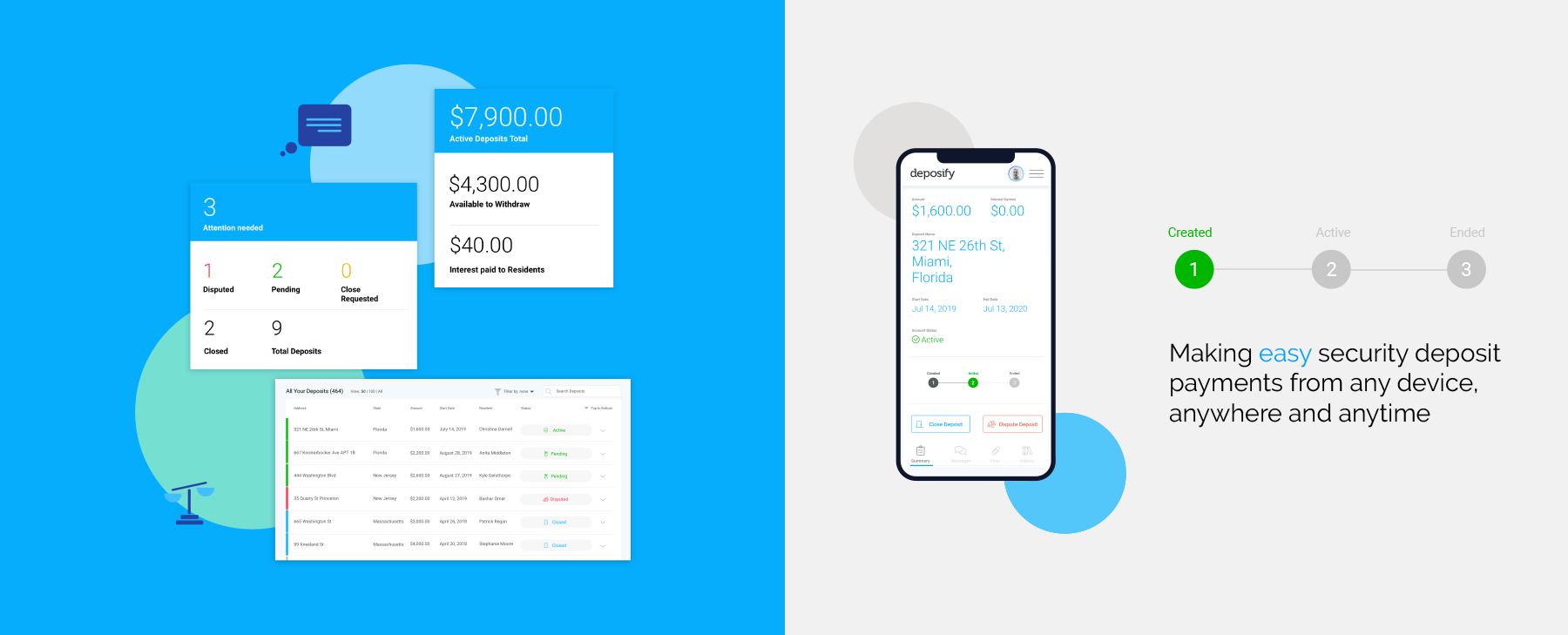
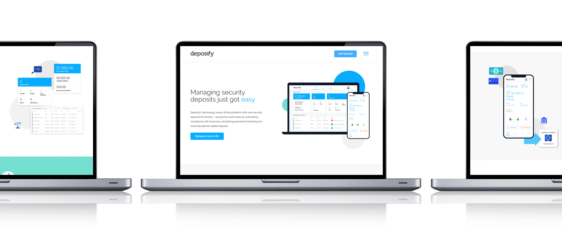
With our customer defined we continued the workshop, shifting the focus to generating a concise customer value proposition. We explored the product offer and then clearly defined its role and benefits in the eyes of the target customer. This workshop took place over a day at our offices in Dublin and helped us build a platform for our creative writing process. As a result of the workshop, three clear themes emerged for the brand proposition: convenience, ease of use and reduced risk. These themes allowed us to establish an effective CVP for Deposify – Managing security deposits just got easy. We also defined clear USPs for the product and segmented them into two separate narratives of Cash and Data – keeping our focus on their unique benefits to the customer. In order to bring this new messaging to life in a distinctive way we also created a new visual look and feel for the brand. We took the blue dot that sits within the Deposify logo and brought it to life in a minimal, geometric look that at the same time playfully integrates with the other visual elements on the page. Deposify is a service that is all about making complex systems easier to use and manage. By using simple geometric shapes and illustrations in a minimal and modern way we are paralleling the same message of benefit and ease within the entire visual architecture of the Deposify brand.